[TIL] 엘리스 SW 엔지니어 트랙 Day 065
반응형

📖 오늘 배운 내용 - 2022.01.21
- styled component
- SCSS in styled component
📝 인접 요소 연산자(Adjacent sibling combinator)
[CSS] 인접 요소 연산자(Adjacent sibling combinator)
🎯 인접 요소 연산자(Adjacent sibling combinator) One Two! Three li:first-of-type + li { color: red; } 📌 참고 Adjacent sibling combinator - CSS: Cascading Style Sheets | MDN
lakelouise.tistory.com
📝 SCSS in styled component
const SCSSStyledDiv = styled.div`
    background-color: orange;
    color: white;

    div {
        background-color: red;
    }

    .purple {
        background-color: purple;
    }
`;

function Test() {
    return (
        <SCSSStyledDiv>
            parent elem with className(orange)
            <div>child(red)</div>
            <div className={"purple"}>
                child elem with className(purple)
            </div>
        </SCSSStyledDiv>
    )
}- +, & 등 여러 선택자를 사용할 수 있다.
- 중첩 선택자 스타일링 가능하다.
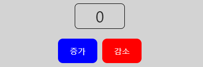
📕 예시
import { useState } from "react";
import styled from "styled-components";

const Container = styled.div`
  padding: 10px;
  background-color: lightgray;
  display: flex;
  flex-direction: column;
  align-items: center;
`

const ButtonsContainer = styled.div`
  margin-top: 20px
`

const Count = styled.div`
  width: 100px;
  height: 50px;
  line-height: 50px;
  font-size: 2rem;
  border: 1px solid black;
  border-radius: 8px;
  text-align: center;
`

const Button = styled.button`
  color: white;
  width: 80px;
  height: 50px;
  text-align: center;
  border-radius: 10px;

  background-color: ${props => props.inc ? "blue" : "red"};

  + button {
    margin-left: 10px;
  }

  &:hover {
    box-shadow: 10px 5px 5px gray;
  }
`

export default function App() {
  const [count, setCount] = useState(0)

  return (
    <Container>
      <Count>{count}</Count>
      <ButtonsContainer>
         <Button onClick={() => setCount(count+1)} inc={true}>증가</Button>
         <Button onClick={() => setCount(count-1)} dec>감소</Button>
      </ButtonsContainer>
    </Container>
    )
}
📝 props마다 색상 다르게 해주기 & 가상 선택자 ::before를 사용해서 background-color 지정하기
const Language = styled.p`
  font-weight: bold;
  font-size: 12px;
  line-height: 12px;
  color: ${props=> getColorByLang(props.lang)};
  position: relative;
  padding: 4px 6px;
  + p {
    margin-left: 8px;
  }

  ::before {
    content: "";
    position: absolute;
    top: 0;
    bottom: 0;
    left: 0;
    right: 0;
    background-color: ${props=> getColorByLang(props.lang)};
    opacity: 0.2;
    border-radius: 2px;
  }
`
<LanguageWrapper>
{languages.map((lang, idx) => {
return (
<Language
key={`${lang}-${idx}-${title}`}
lang={lang}
>
{lang}
</Language>
)
})}
</LanguageWrapper>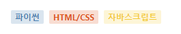
- before 선택자 상위 element가 p태그다. p태그의 포지션이 relative, before 태그의 포지션이 absolute다. 위치를 0으로 했기 때문에 before의 기준이 p태그가 된다.
💡 오늘 깨달은 것
- 기존에는 js를 이용해서 상황에 따라 미리 만들어 놓은 css 클래스 add 또는 remove를 했는데 styled component를 사용하면 props를 받아서 상황에 맞게 처리해줄 수 있는 점이 강점으로 느껴졌다.
- toLocaleString()는 3자리마다 콤마를 찍어준다.
반응형
'프로그래밍 > Today I Learned' 카테고리의 다른 글
| [TIL] 엘리스 SW 엔지니어 트랙 Day 067 (0) | 2022.01.26 |
|---|---|
| [TIL] 엘리스 SW 엔지니어 트랙 Day 066 (0) | 2022.01.25 |
| [TIL] 엘리스 SW 엔지니어 트랙 Day 064 (0) | 2022.01.20 |
| [TIL] 엘리스 SW 엔지니어 트랙 Day 063 (0) | 2022.01.19 |
| [TIL] 엘리스 SW 엔지니어 트랙 Day 062 (0) | 2022.01.18 |