[React] 리액트 차트 라이브러리 :: Recharts 사용법
반응형

🎯 Recharts 사용하기
- 프로젝트에서 데이터 시각화하는 부분을 마크업 하게 되었다.
- 아래 링크에서 사람들이 많이 사용하는 차트 라이브러리 리스트를 보면서 장/단점을 검색한 후 심플하고 사용법이 간단한
Recharts를 사용하기로 결정했다.
10 Best React Chart Libraries in 2022 | Openbase
A comparison of the 10 Best React Chart Libraries in 2022: react-flexmonster, react-horizontal-bar-chart, frappe-gantt-react, zingchart-react, react-bpmn and more
openbase.com
📝 Recharts 설치
npm install recharts
📝 Recharts 사용 방법
📕 원하는 차트를 Examples에서 고른다.
📕 Examples 코드 복사
- 원하는 차트를 클릭하고
Try the demo in codesandbox >>]클릭해서 코드를 복붙 해온다.
📕 각자 알맞게 커스텀하기
- 자신의 상황에 맞춰 API문서를 보며 데이터를 수정해주면 된다.
- 나는 프로젝트에서 SimpleLineChart와 PieChartWithPaddingAngle를 사용하게 되었다.
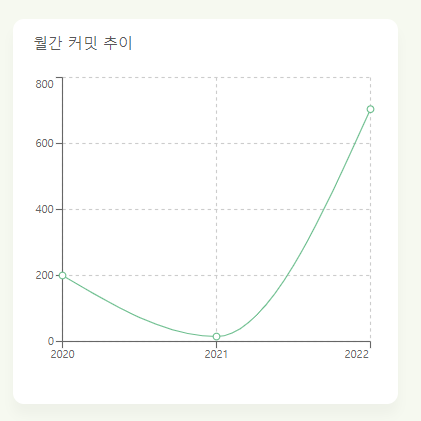
📝 SimpleLineChart 커스텀하기
🛠 index.js
import React from "react";
import * as LineGraphs from "./style";

import {
  LineChart,
  Line,
  XAxis,
  YAxis,
  CartesianGrid,
  Tooltip,
} from "recharts";

LineGraph.defaultProps = {
  commitData: [
    {
      name: "2020",
      commit: 200,
    },
    {
      name: "2021",
      commit: 15,
    },
    {
      name: "2022",
      commit: 704,
    },
  ],
};

export function LineGraph({ graphTitle, commitData }) {
  return (
    <LineGraphs.Container>
      <LineGraphs.Title>{graphTitle} 커밋 추이</LineGraphs.Title>
      <LineGraphs.Wrapper>
        {commitData && (
          <LineChart width={350} height={280} data={commitData}>
            <CartesianGrid strokeDasharray="3 3" />
            <XAxis dataKey="name" />
            <YAxis />
            <Tooltip />
            <Line
              type="monotone"
              dataKey="commit"
              stroke="#6ABD8C"
              activeDot={{ r: 2 }}
              isAnimationActive={false}
            />
          </LineChart>
        )}
      </LineGraphs.Wrapper>
    </LineGraphs.Container>
  );
}
- https://recharts.org/en-US/api/LineChart 들어가서 알맞게 커스텀을 진행했다.
<LineChart width={350} height={280} data={commitData}>이 부분에서 data={commitData}로 수정해주었고- 애니메이션 기능을 없애기 위해
isAnimationActive={false}을 추가해줬다. - LineGraph의 해당 Child Components의 api를 클릭하면 Properties기능들을 볼 수 있다. 영어로 나와있어서 천천히 읽어보거나 구글 번역기 돌려서 빠르게 캐치한 뒤 커스텀하는 것을 추천한다.
🛠 style.js
import styled from "styled-components";

export const Container = styled.div`
  position: relative;
  width: 350px;
  height: 350px;
  background-color: white;
  border-radius: 10px;
  margin-top: 20px;
  margin-bottom: 23px;
  box-shadow: 0 14px 28px rgb(0 0 0 / 0%), 0 10px 10px rgb(0 0 0 / 3%);
`;

export const Wrapper = styled.div`
  position: absolute;
  top: 48px;
  right: 20px;
`;

export const Title = styled.h5`
  font-size: 13.55px;
  margin-left: 18px;
  margin-top: 15px;
`;
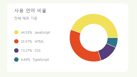
📝 PieChartWithPaddingAngle 커스텀하기
🛠 index.js
import React from "react";
import { PieChart, Pie, Sector, Cell } from "recharts";
import githubLangColors from "./github-lang-colors.json";
import * as PieCharts from "./style";

PieChartComponent.defaultProps = {
  codeRatioArray: [
    { name: "JavaScript", value: 44.53 },
    { name: "HTML", value: 35.57 },
    { name: "CSS", value: 13.27 },
    { name: "TypeScript", value: 6.64 },
  ],
};

export function PieChartComponent({ codeRatioArray }) {
  const langColor = githubLangColors;
  const COLORS = codeRatioArray.map((it) => {
    const langName = it.name;
    return langColor[langName];
  });

  return (
    <PieCharts.Container>
      <PieCharts.Wrapper>
        <PieCharts.Heading>
          <PieCharts.Title>사용 언어 비율</PieCharts.Title>
          <PieCharts.Description>전체 레포 기준</PieCharts.Description>
        </PieCharts.Heading>
        <PieCharts.RatioWrapper>
          {codeRatioArray &&
            codeRatioArray.map((it, idx) => (
              <PieCharts.LangColorBoxWrapper key={`${it.name}-${it.value}`}>
                <PieCharts.LangColorBox idx={COLORS[idx]} />
                <div>
                  <PieCharts.LangText>{it.value}%</PieCharts.LangText>
                  <PieCharts.LangText>{it.name}</PieCharts.LangText>
                </div>
              </PieCharts.LangColorBoxWrapper>
            ))}
        </PieCharts.RatioWrapper>
      </PieCharts.Wrapper>

      <PieCharts.PieWrapper>
        <PieChart width={200} height={200}>
          <Pie
            data={codeRatioArray}
            cx="50%"
            cy="50%"
            innerRadius={40}
            outerRadius={70}
            fill="#8884d8"
            dataKey="value"
            isAnimationActive={false}
          >
            {codeRatioArray.map((entry, index) => (
              <Cell
                key={`cell-${index}`}
                fill={COLORS[index % COLORS.length]}
              />
            ))}
          </Pie>
        </PieChart>
      </PieCharts.PieWrapper>
    </PieCharts.Container>
  );
}
🛠 style.js
import styled from "styled-components";

export const Container = styled.div`
  background: white;
  width: 350px;
  height: 200px;
  position: relative;
  display: flex;
  justify-content: space-between;
  border-radius: 10px;
`;

export const Wrapper = styled.div`
  margin-left: 20px;
  margin-top: 14px;
`;

export const Heading = styled.div`
  margin-bottom: 30px;
`;

export const Title = styled.h5`
  font-size: 14px;
  color: ${(props) => props.theme.darkGray};
  margin-bottom: 10px;
`;

export const Description = styled.span`
  font-size: 9px;
  color: ${(props) => props.theme.lightGray};
`;

export const RatioWrapper = styled.div``;

export const LangColorBox = styled.div`
  background-color: ${({ idx }) => idx};
  width: 12.5px;
  height: 12.5px;
  border-radius: 50%;
  margin-right: 7px;
`;

export const LangColorBoxWrapper = styled.div`
  display: flex;
  align-items: center;
  margin-bottom: 14px;
`;

export const PieWrapper = styled.div``;

export const LangText = styled.span`
  font-size: 9px;
  color: ${(props) => props.theme.lightGray};

  margin-right: 7px;
`;
- 사용 방법은 SimpleLineChart와 동일하다. api 문서를 잘 읽어보자!
📌 참고
반응형
'프로그래밍 > React' 카테고리의 다른 글
| [React] 리액트 React.lazy와 Suspense란? (0) | 2022.02.15 |
|---|---|
| [React] 리액트 PropTypes 사용하기 (0) | 2022.02.15 |
| [React] 리액트 조건부 렌더링 방법 (0) | 2022.02.10 |
| [styled-components] 초기 CSS 세팅하기(GlobalStyles, styled-reset, ThemeProvider) (0) | 2022.02.08 |
| [React] Debounce와 Throttle이란? (0) | 2022.01.25 |